Instagram has rolled out a couple of changes in its interface and logo designs.
The interface
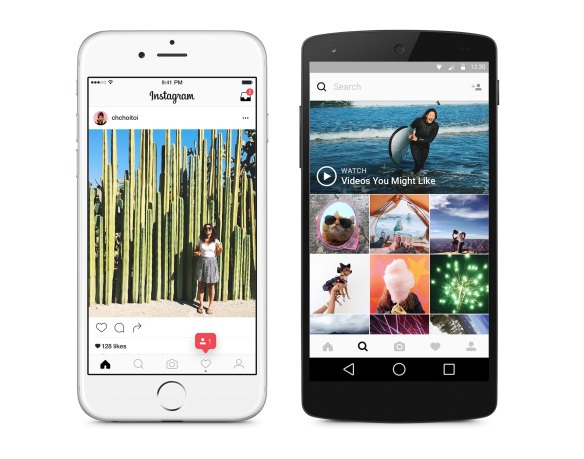
The changes in the interface have been strictly formational and not functional. The where’s-where of all icons remain the same, whereas the app icons now look much simpler.
The icons have also been stripped of their colors, adopting black & white coloring.
The changes seem to be serving the purpose of making shared videos, GIFs and photos stand out more.
The logo
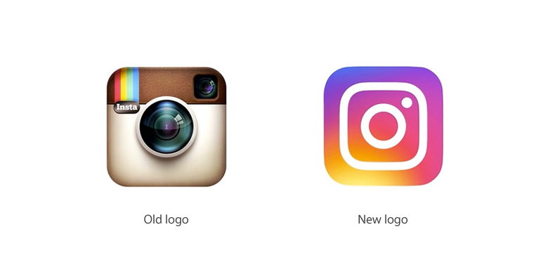
Perhaps the most apparent of the new design choices is the new Instagram logo.
The old logo had the obvious shape of a camera shutter. The new logo however moves away from the obvious in favor of the implied. It has a stylized camera shutter and much more vibrant colors.
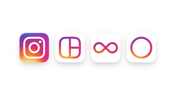
Instagram did more than just changing its app logo. The logo design changes affect not only Instagram, but also its sister applications like Hyperlapse, Layout and Boomerang.


